Cincinnati Annual Report
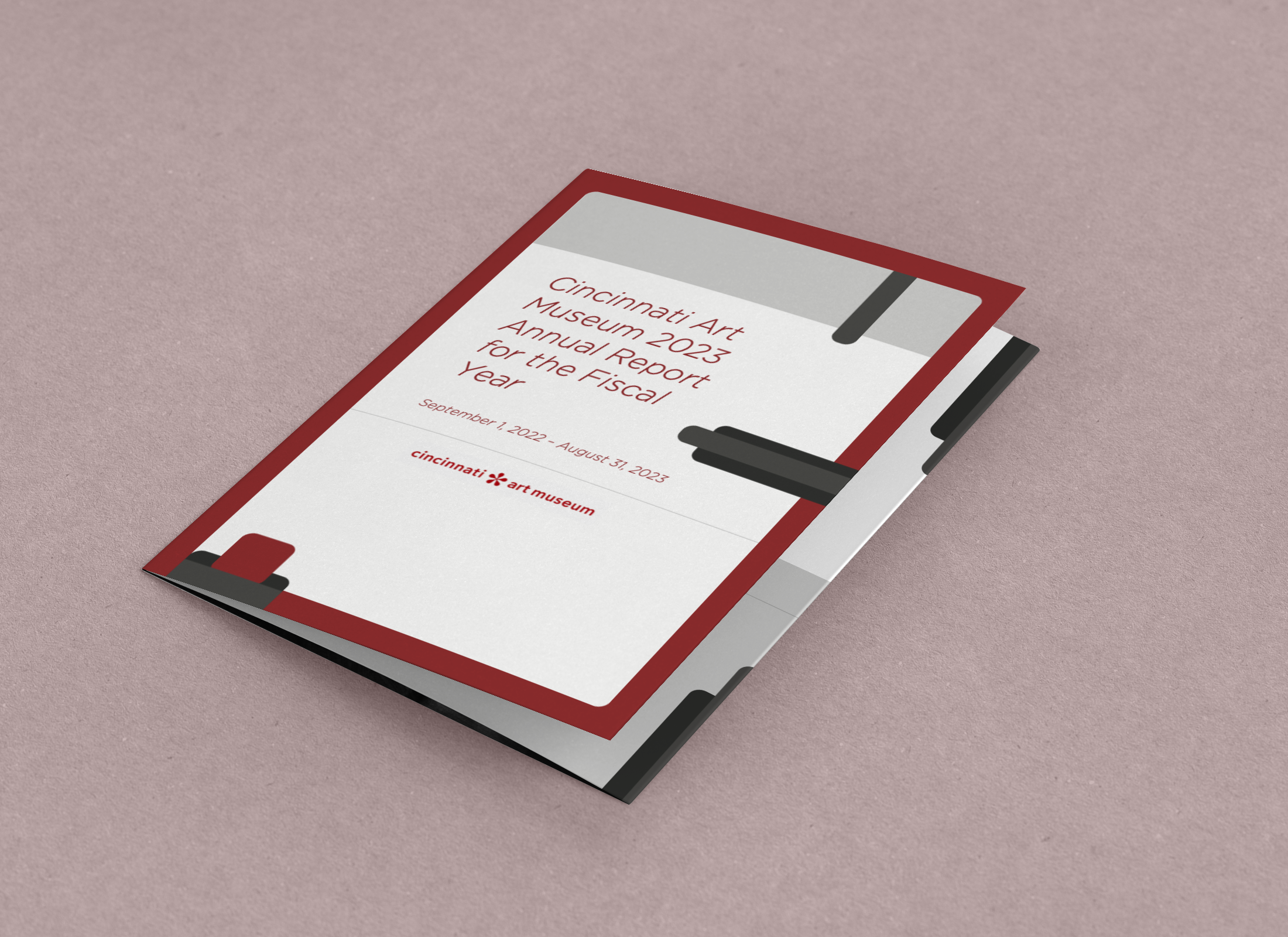
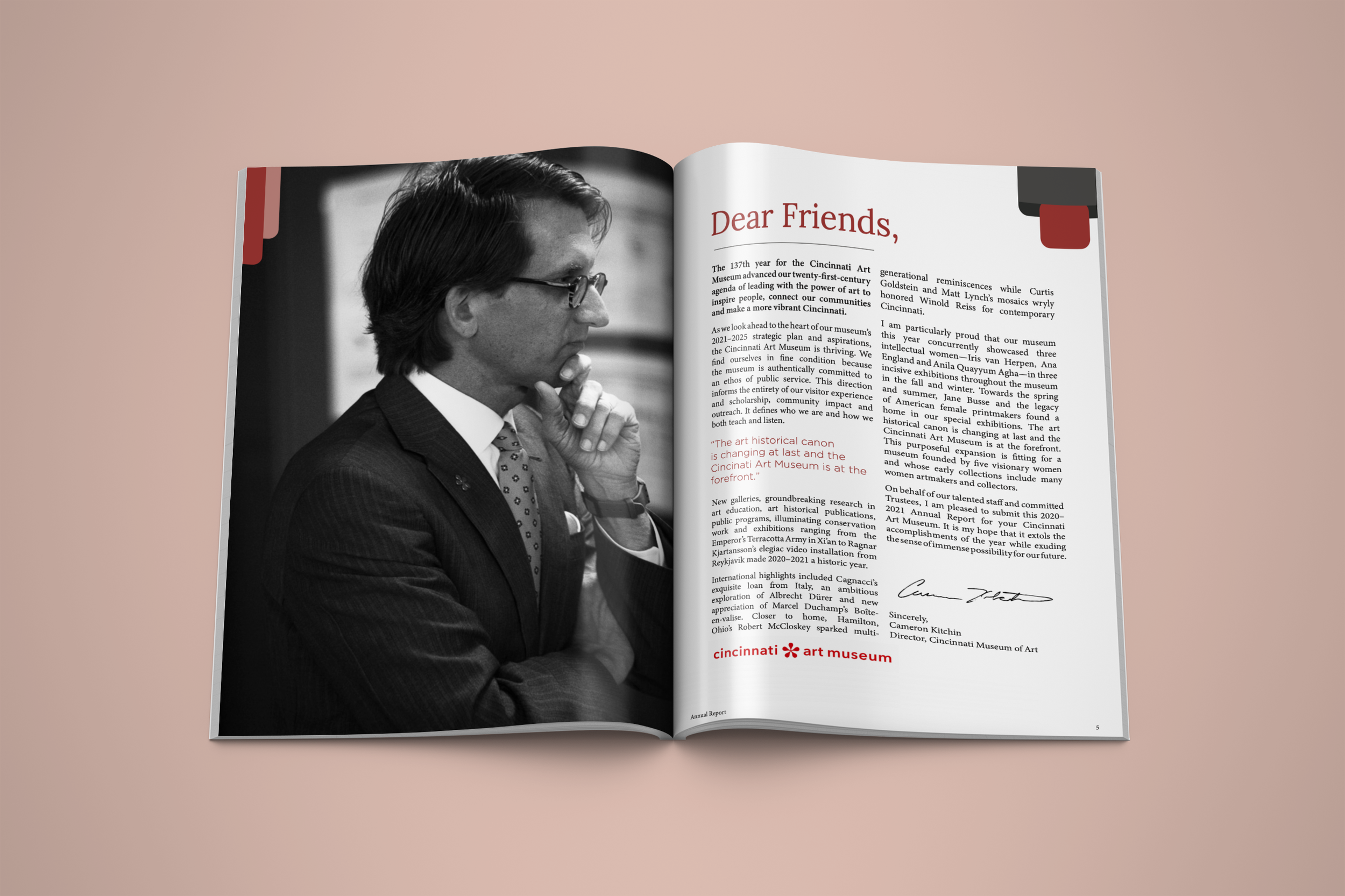
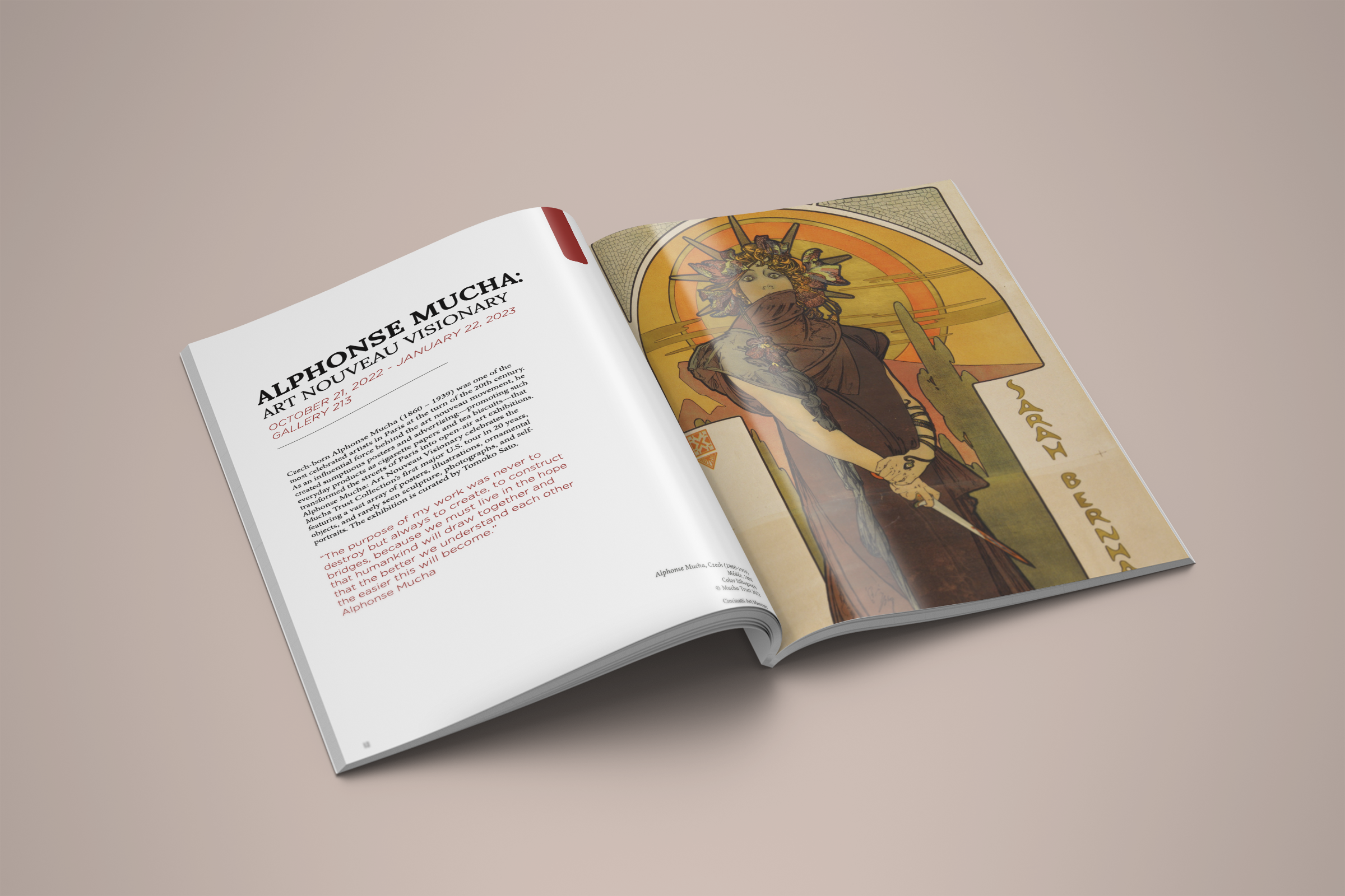
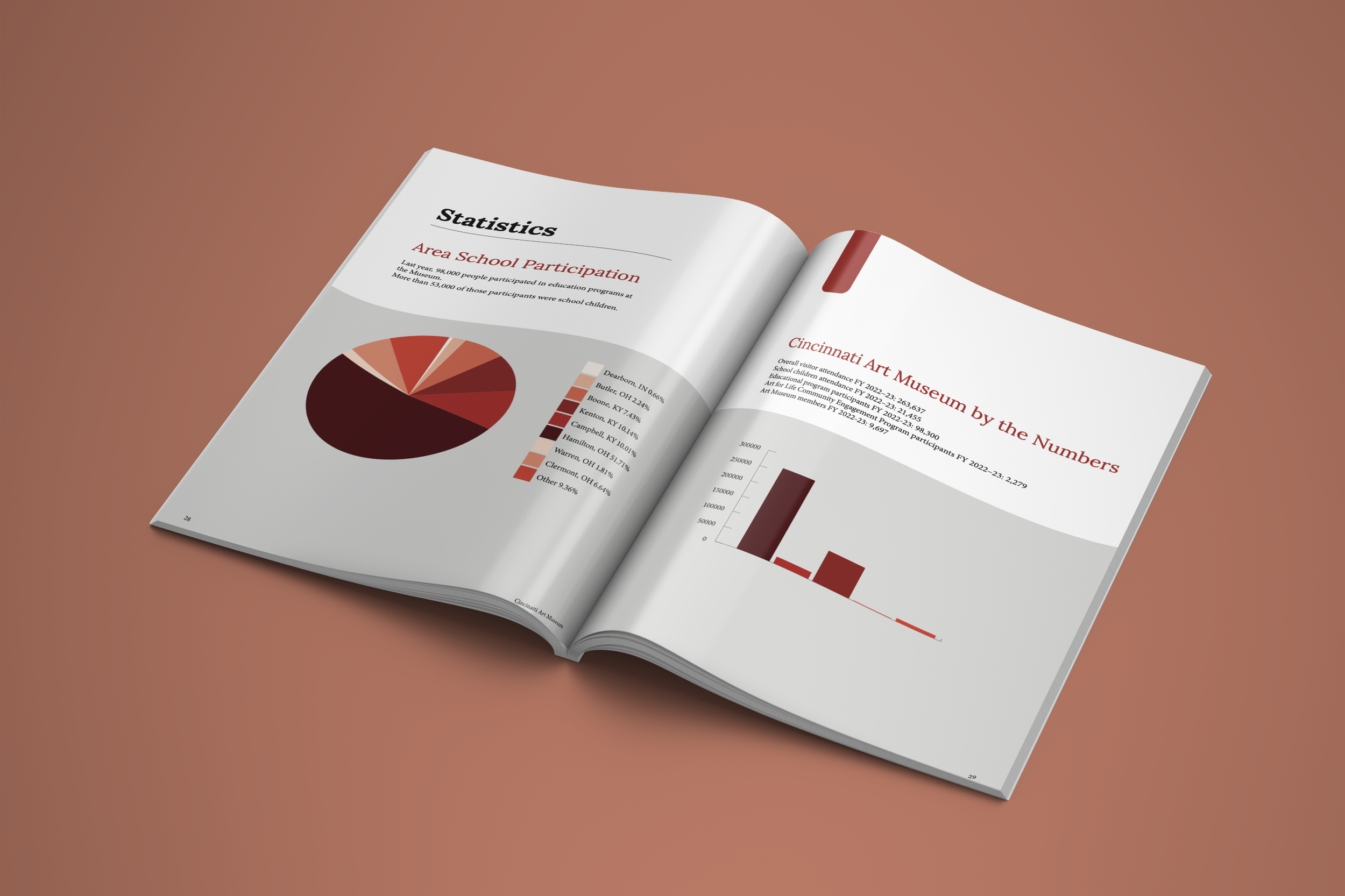
This annual report for the Cincinnati Art Museum was an opportunity for me to explore layout while staying grounded in brand consistency. I chose to build the design around the museum’s existing red, using it as an accent color throughout the booklet rather than introducing a new palette. This helped maintain a clear visual connection to the museum’s identity while allowing the content to remain the focus.
I balanced experimentation with clarity, using color and imagery intentionally to guide attention and add visual interest without overwhelming the reader. The final booklet reflects my approach to publication design: playful where it can be, restrained where it needs to be, and always mindful of the brand it represents.
