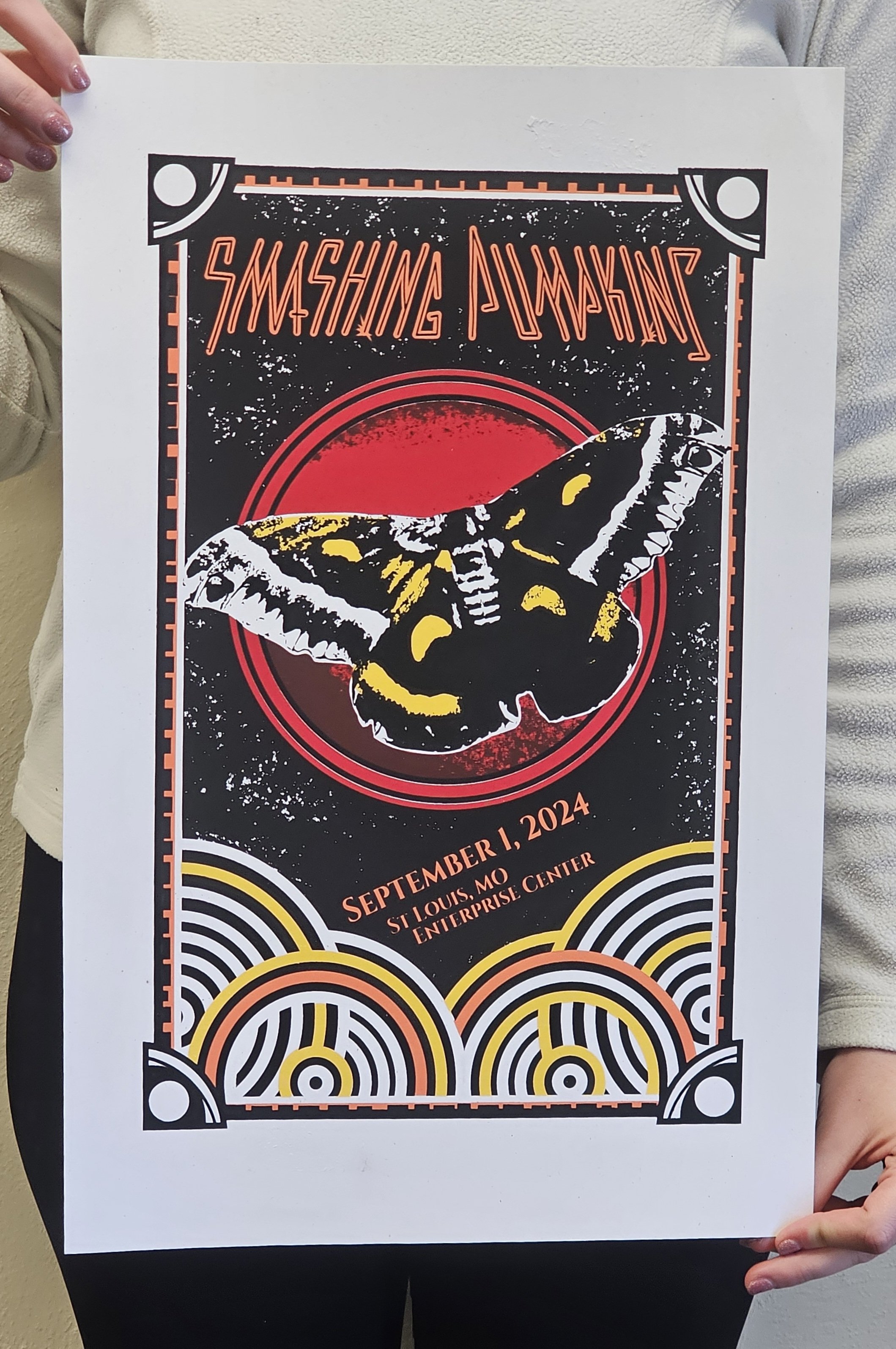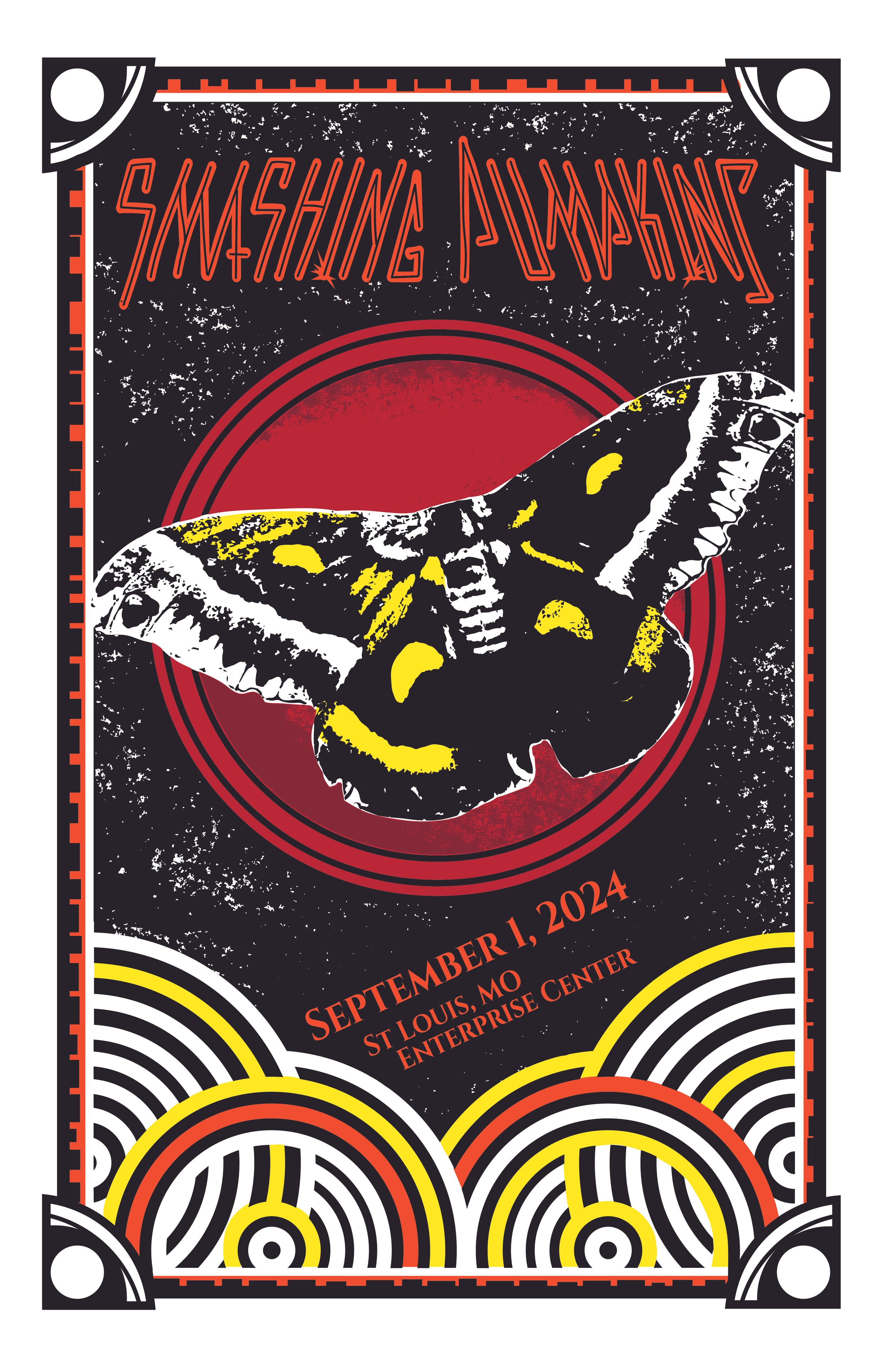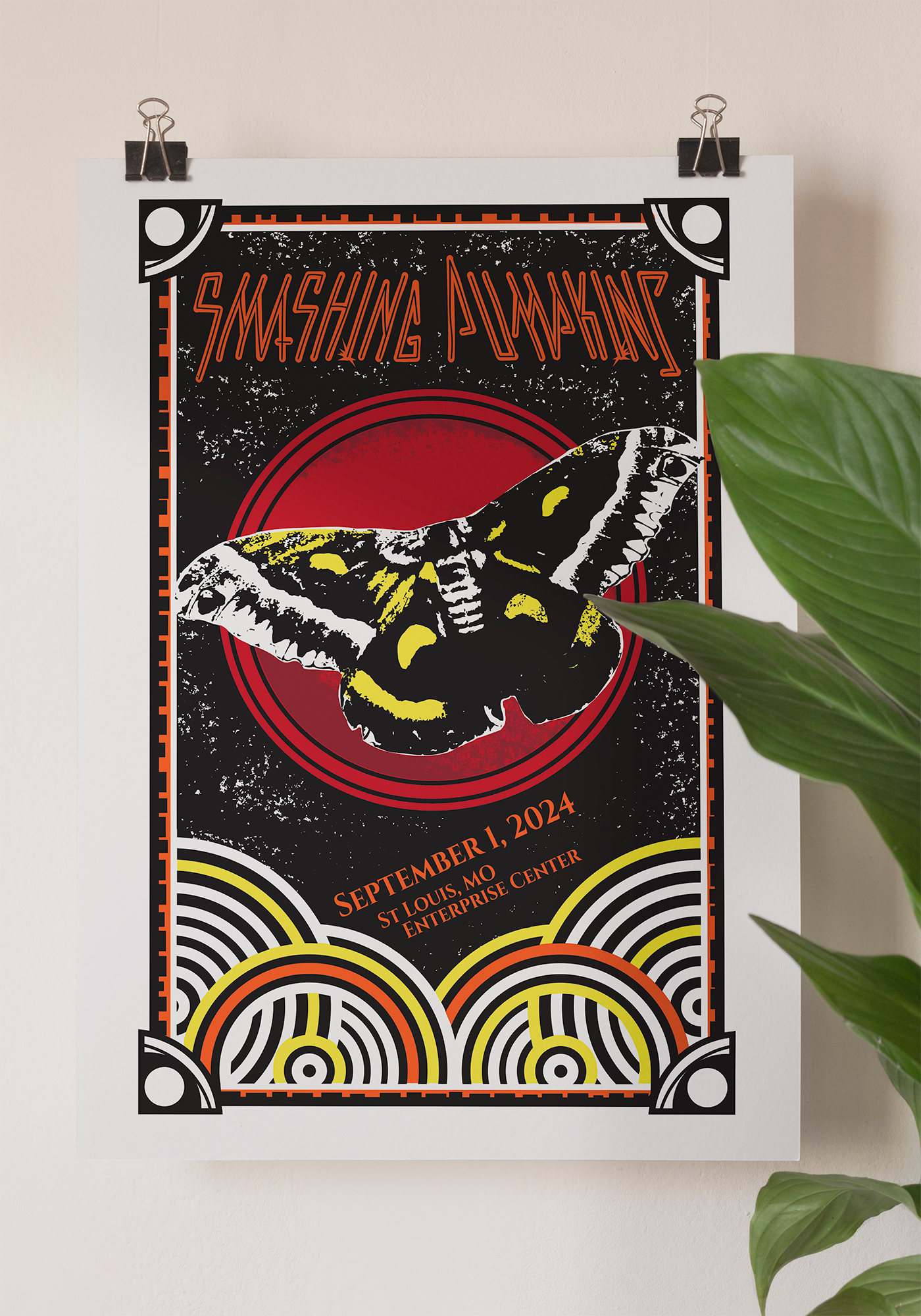
Concert Poster Print
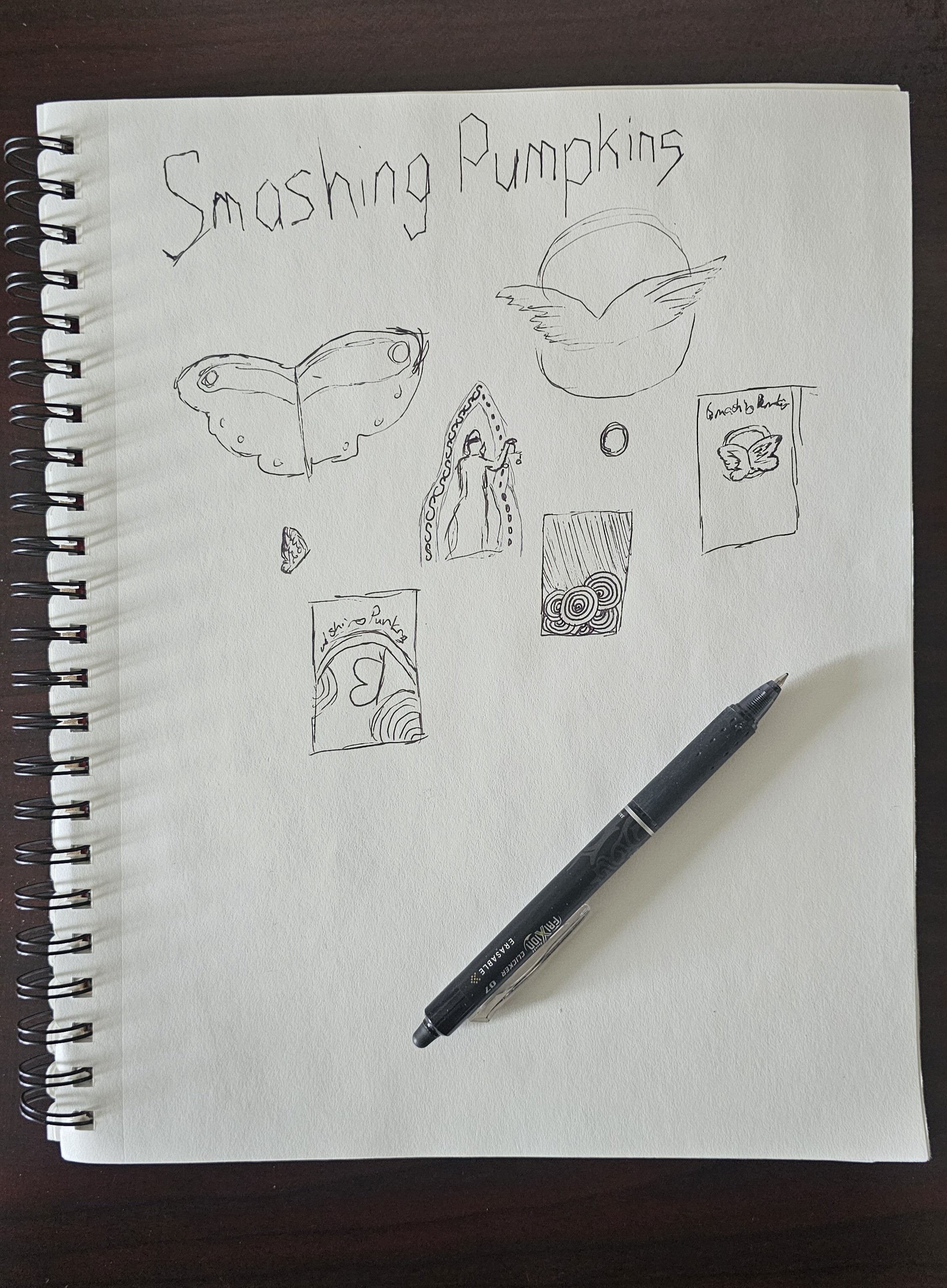
This poster was created for a design course that challenged us to work with no fewer than five colors, and it remains a project I still think about fondly. Choosing a concert poster format made it possible to lean into a grungier aesthetic, drawing direct inspiration from the Smashing Pumpkins’ own history of promotional materials.
I looked closely at several of the band’s past concert posters, particularly their frequent use of red, bold central imagery, and symbolic elements like wings. Those references informed the overall composition, while the final illustration puts a personal spin on those familiar motifs rather than replicating them outright. The result balances homage with originality, using color, texture, and scale to capture the energy of the band while meeting the technical constraints of screen printing.