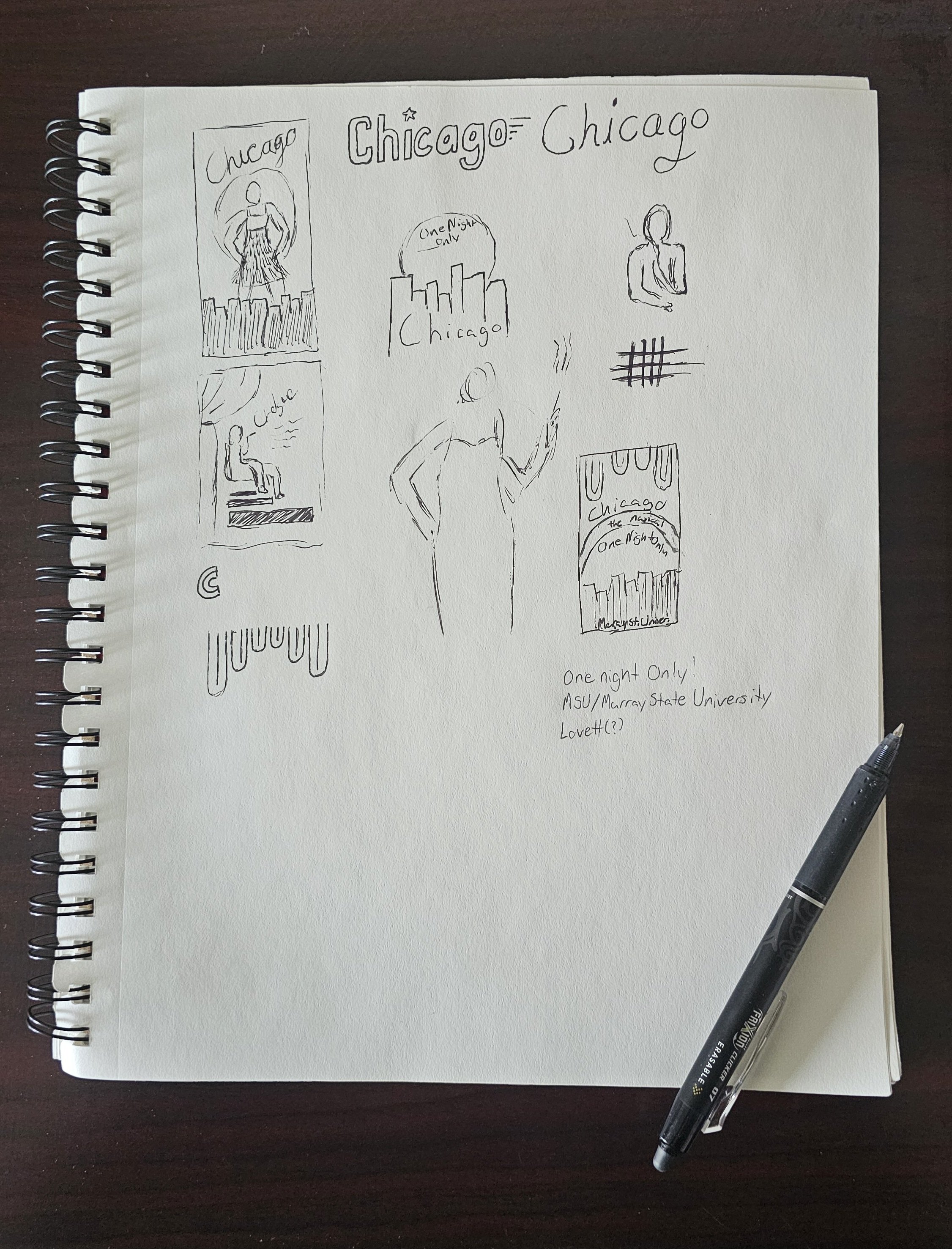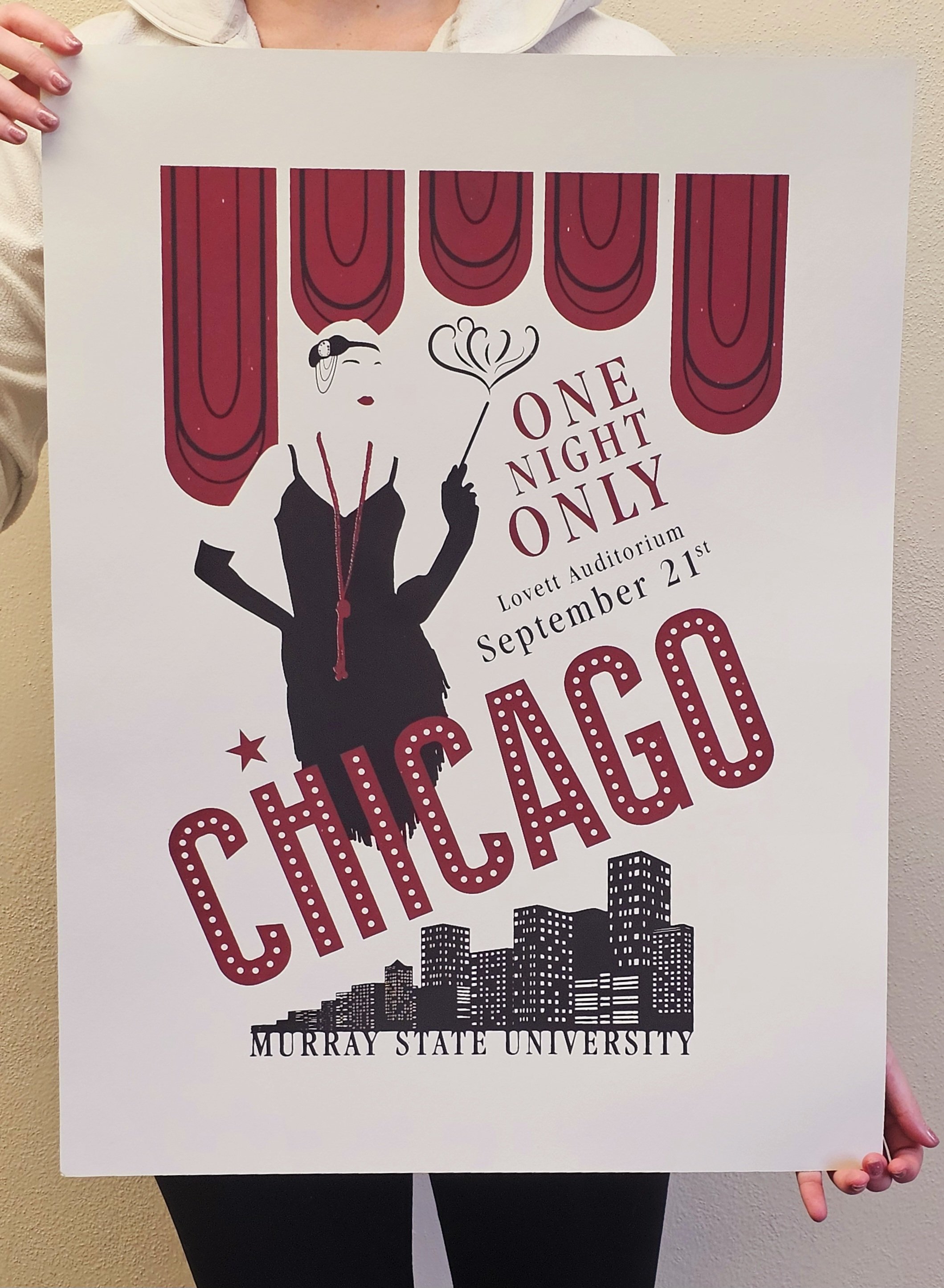
Chicago Print
Working under a strict two-color limit, every design choice for this Chicago poster was intentional. The silhouette of the lead character was developed using her dress and headdress to define her form, with the red curtain behind manipulated to reinforce the outline without relying on traditional lines. Typographic hierarchy was carefully structured: a clean sans serif guides the eye, while varying serif sizes organize supporting information, and the slightly tilted title and smaller text reflect the musical’s chaotic energy. Each element demonstrates deliberate decisions to convey character, mood, and narrative while maintaining clarity within the project’s technical and visual constraints.