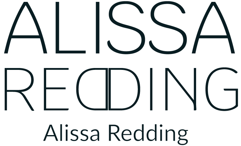
Colby’s Mac and Cheese Bar

Colby’s Mac & Cheese Bar was a final project assigned during my brand identity class. We were tasked with creating a fictional eatery of our choice and, create everything from the logo to a logo guide, stationery, menus, and fully fleshed out collateral. After some thought I decided on a mac and cheese bar that focused on a rustic, homey sort of feel with a warm and inviting atmosphere.
The Name

The first step was creating a logo for this place, I took inspiration from restaurants that have a similar homey feel and a similar vein I wanted a one name place that would be easy to say. During this time I also experimented with color palettes I wanted to play with as well as individual cheese-themed logo art (to keep up with the cheesiness of course).
The Logo

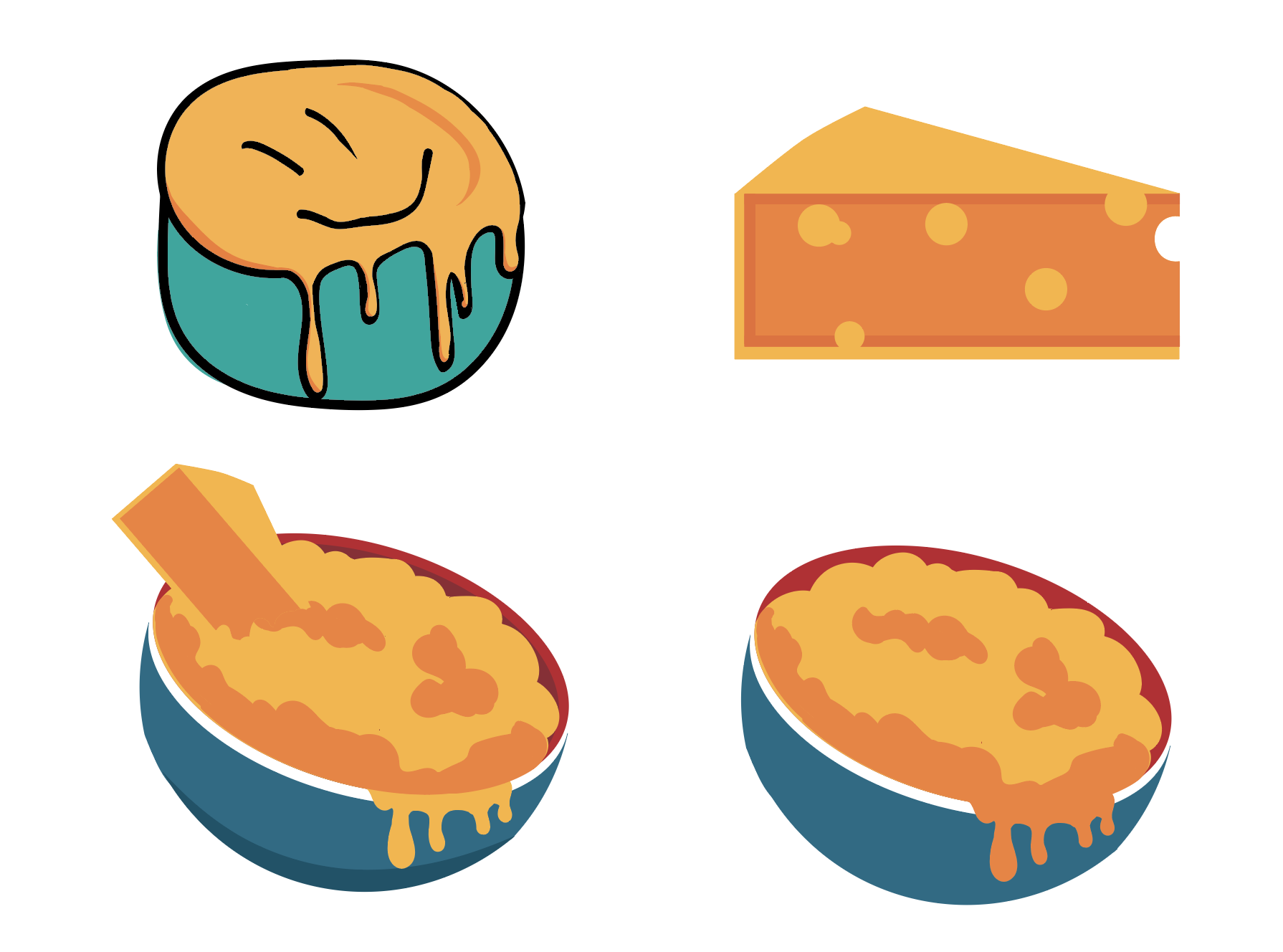
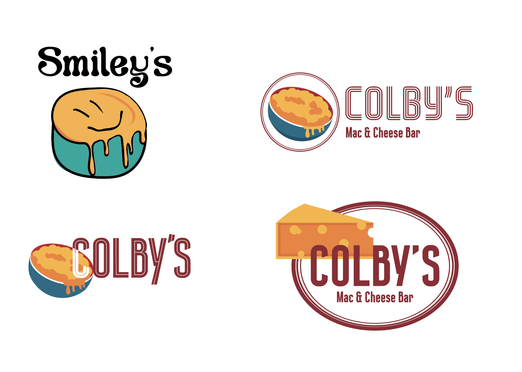
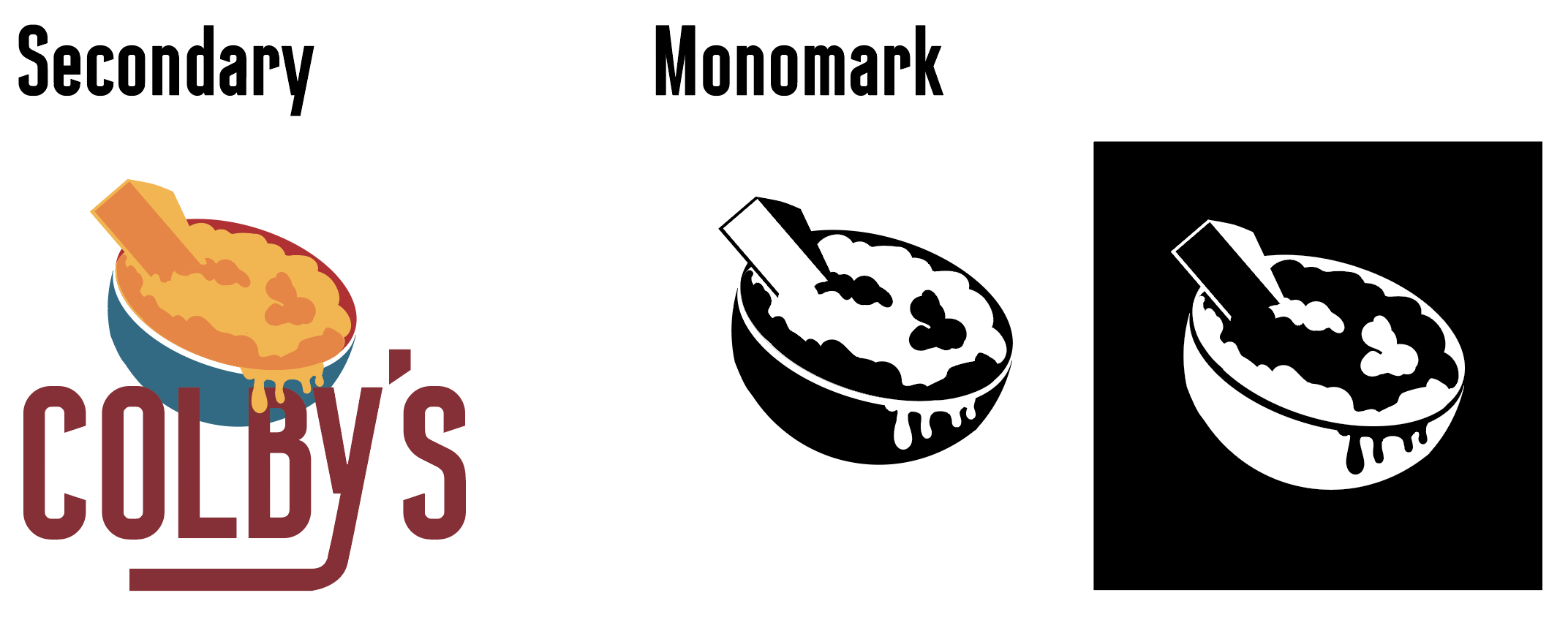
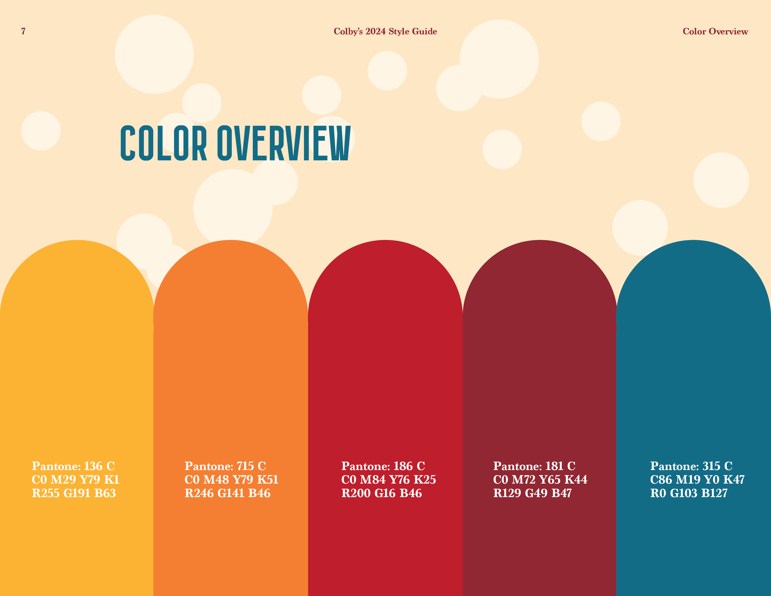
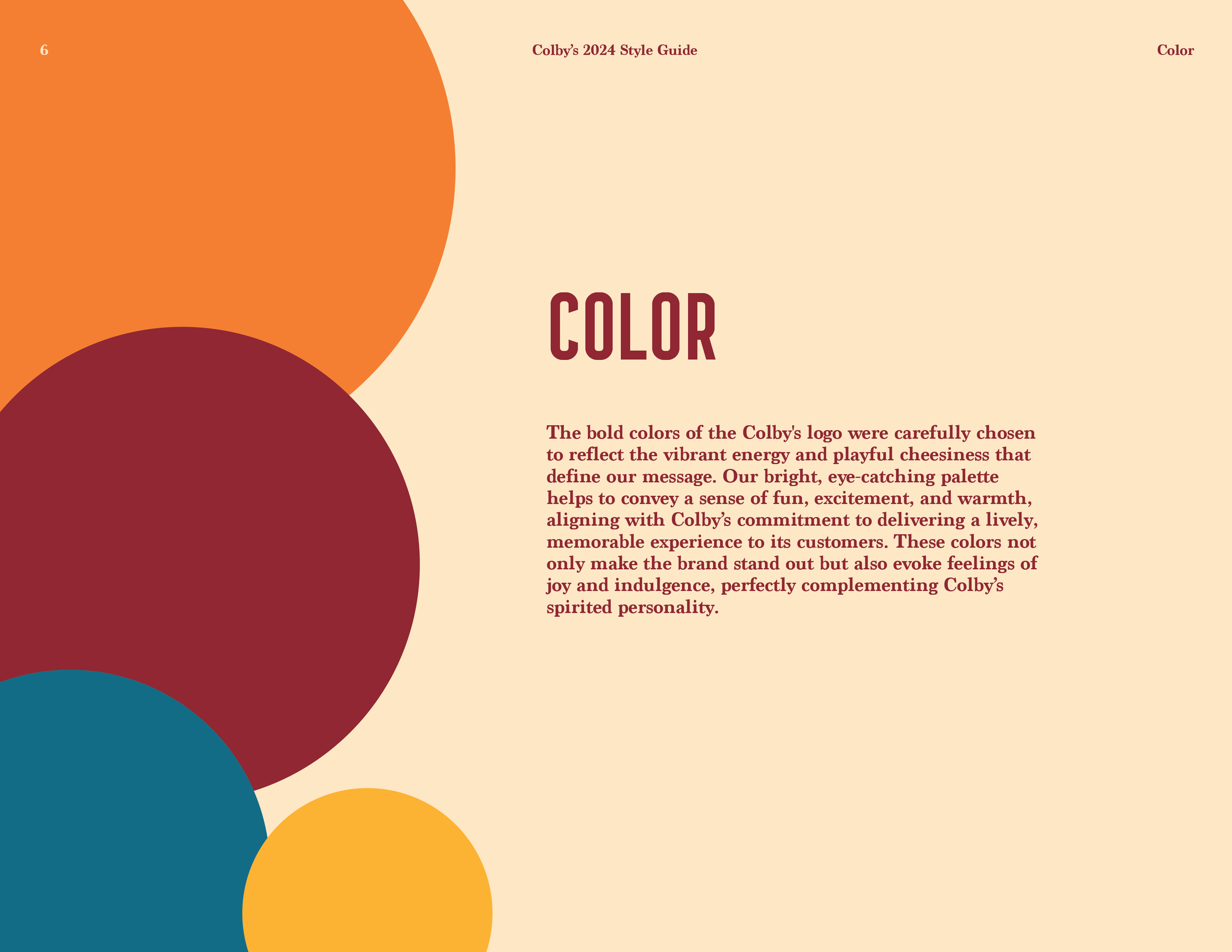
It was quickly decided that Colby’s would be the best name, Smiley’s felt far too close to a pizza place or an eatery geared more towards kids while I wanted this eatery to appeal towards adults while still having a cheese themed name. The result of this experimentation was a fully fledged logo complete with a horizontal and vertical versions, as well as additional marks to use when needed. I wanted the cheese to be the most eye-catching part of this design since the cheese is after all the most important part of a mac and cheese place. Alongside that yellow I chose a darker turquoise and red to bring out the logo text and bowl.
The Logo Family

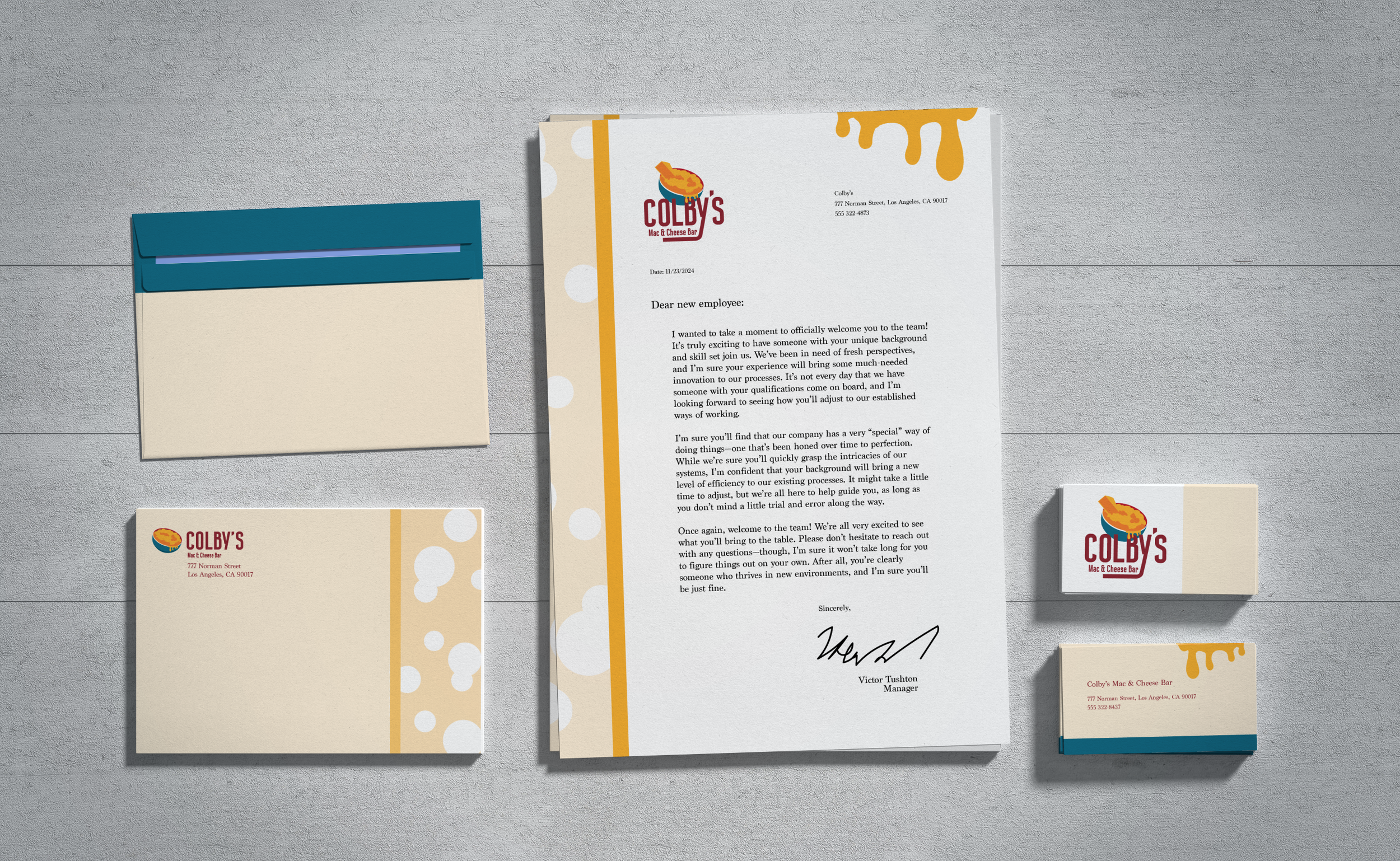
With the first part of this project completed, the next step was to create stationary for the business which included business cards, a letterhead, and envelope design. Keeping with the homey style of the fictional eatery, I decided sticking with a yellow shade as the main coloring for the stationary would be the best choice for the designs. I went with circles throughout the yellow to mimic cheese and keep the mac & cheese theme going, I felt the cheese drip from the original logo art would help to tie together each piece as one consecutive group instead of giving each piece their own individual design style.
The Stationary


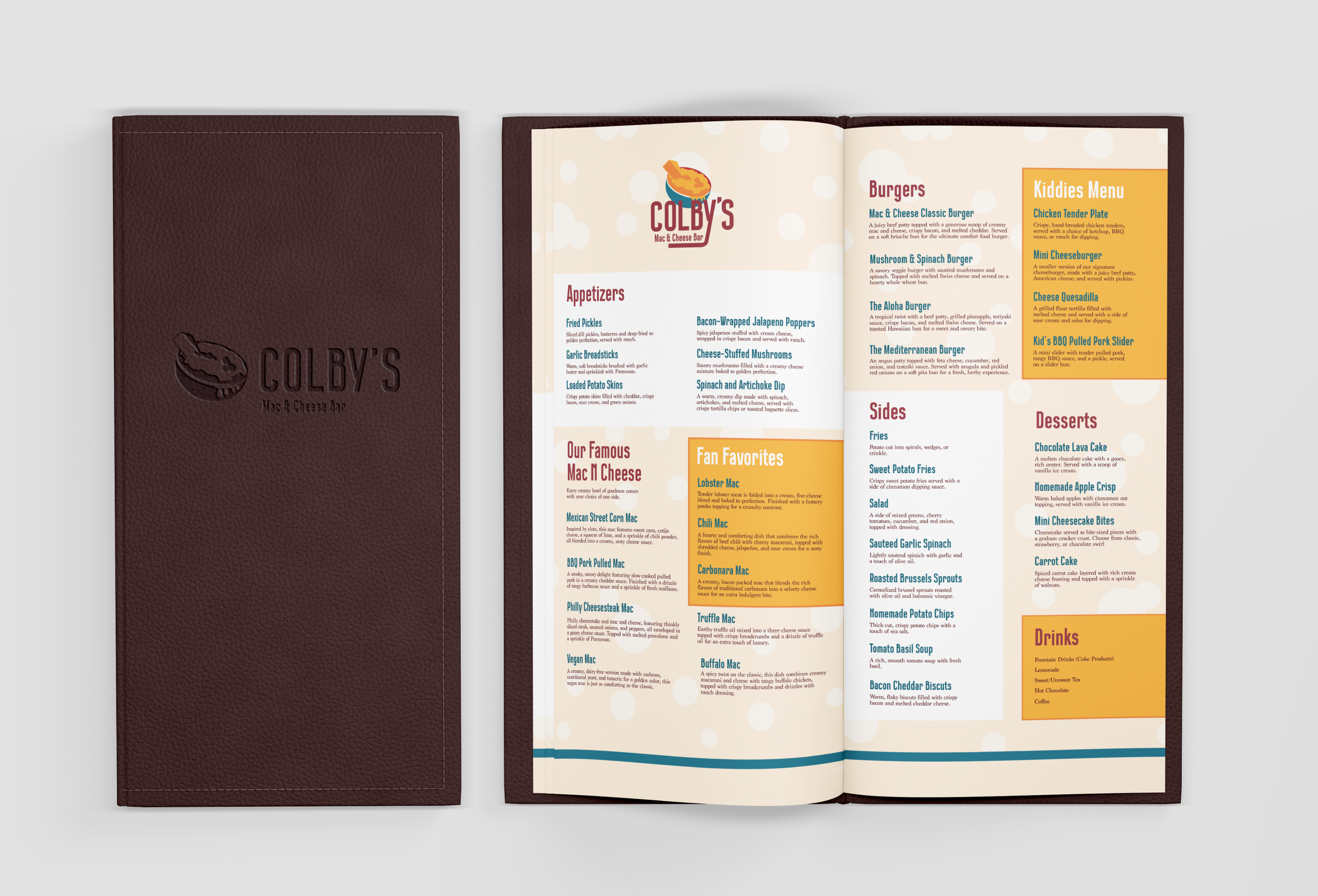
I will admit with no shame the hardest step during this whole process was creating the menus. I didn’t want this place to feel incredibly cheap, and the mass amounts of images of food typically seen with cheaper menus would be a dead giveaway, the same goes for displaying prices and for this reason I decided to avoid both in this instance. The color scheme of the menu was a struggle as well, since I wanted a higher-end feel but for it to also fit into the overall feel of the eatery to up to this point. I was picturing a restaurant with lower lighting, so a menu with a darker color scheme would be more difficult to read.
There was a version I had created before the initial design and it was immediately scrapped for being far too dark. I decided to include it in this study for a comparison of the changes made to arrive at the final design in this process. In the end, this is a design I feel still needs improvement, however, for the sake of the assignment I still believe this design completed it’s task of at least being a legible menu design.
The Menu
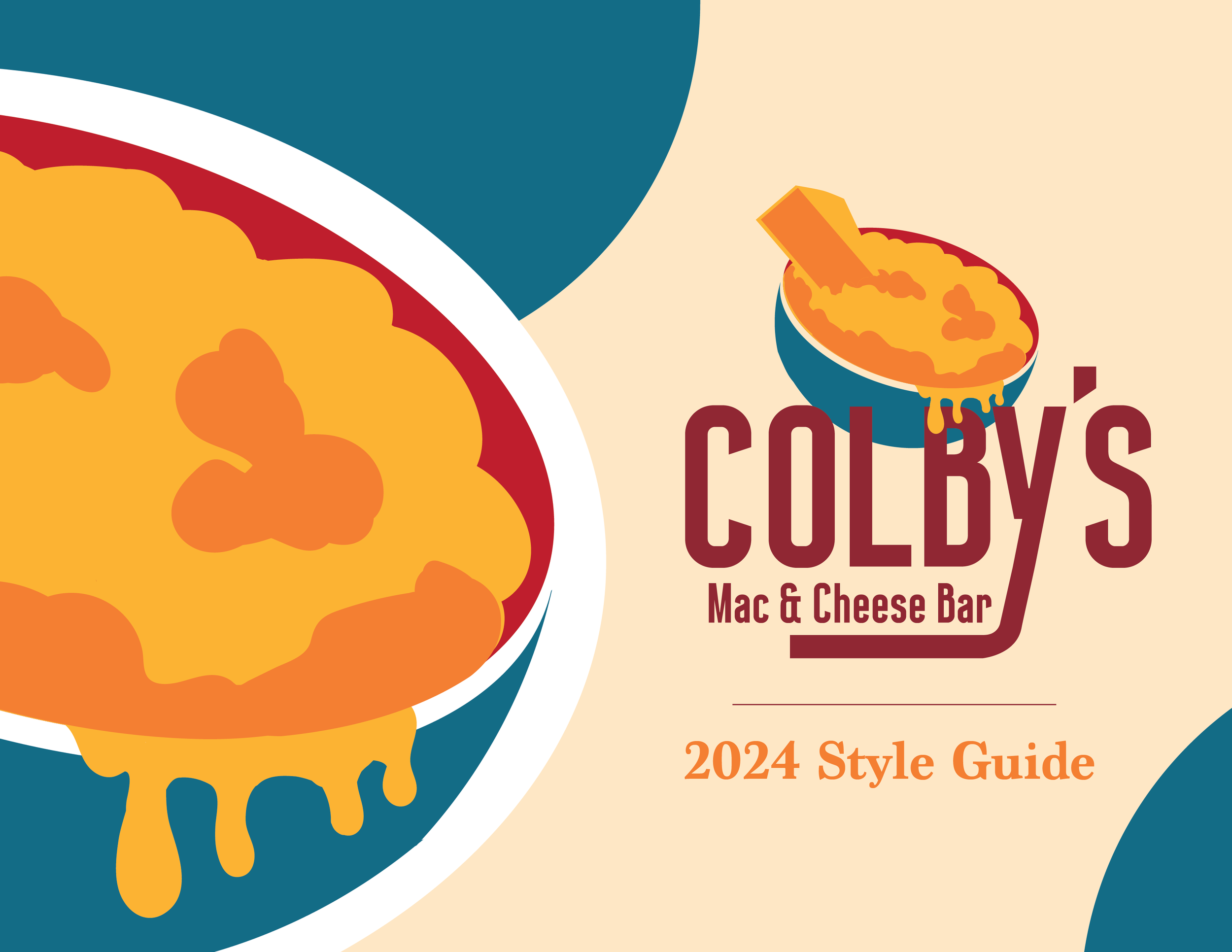
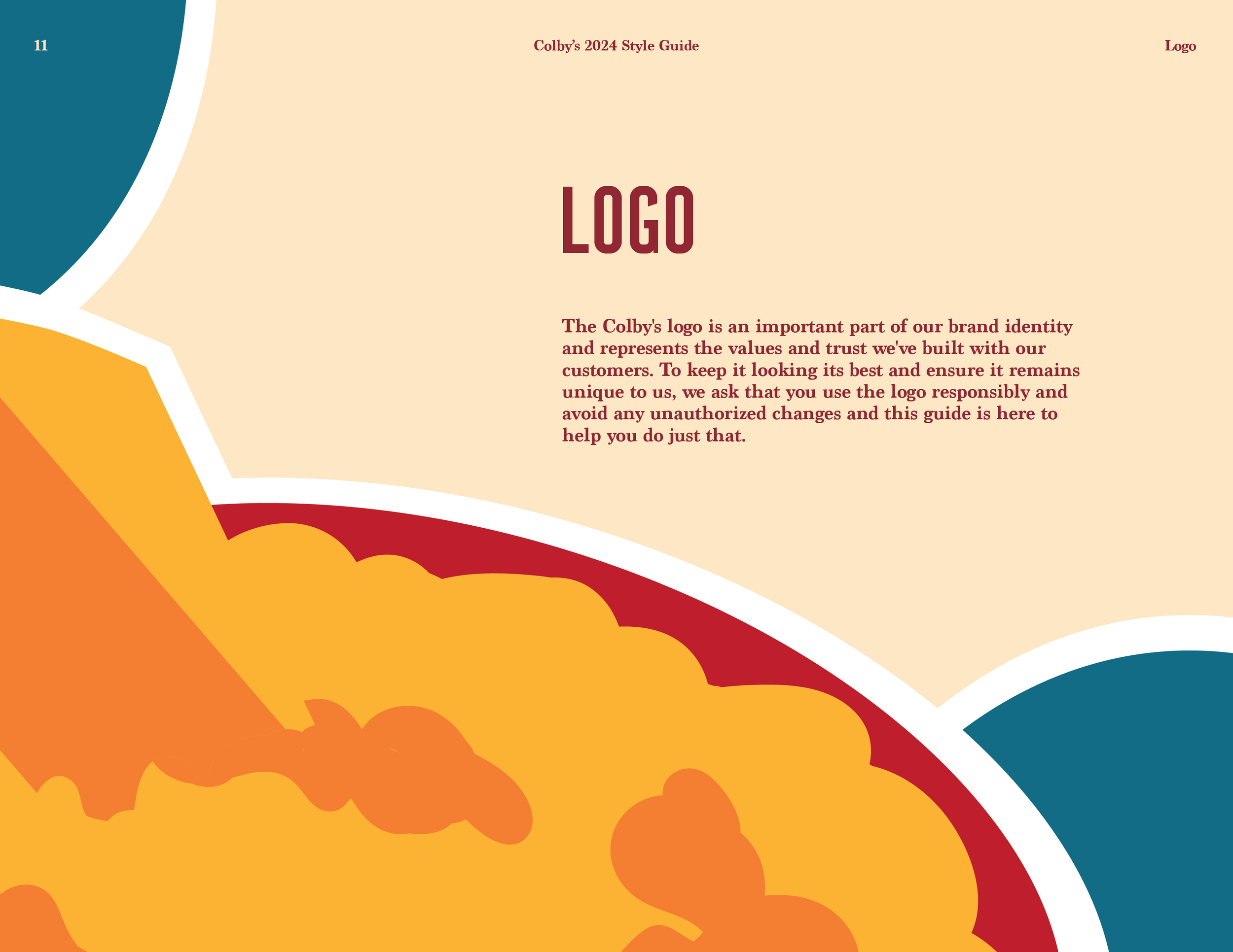
The final step in this branding process was to create a fully fleshed out style guide for the logo and make collateral that would be realistically used in the fictional eatery. I wanted to keep a similar design style in the style guide where the light yellow is the primary color in every section and the accent colors associated with the logo was used in creative ways that mimic the style and feeling of the restaurant itself.
The final product of this guide is one I am still incredibly proud of, the color scheme of each section of the table of contents changes with each topic in the guide to keep the guide orderly and so the reader knows which section they are in when looking through the style guide.
The Style Guide
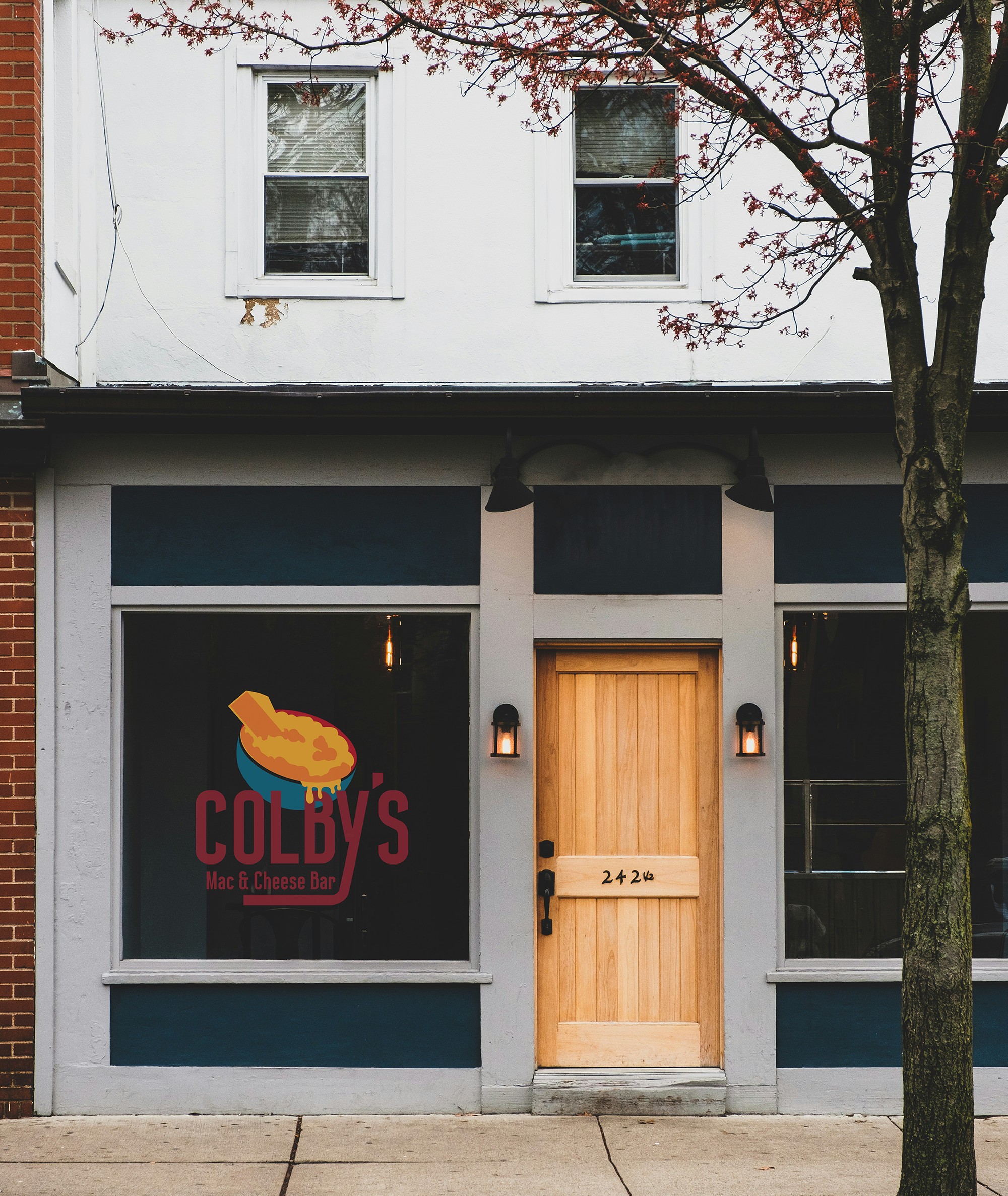
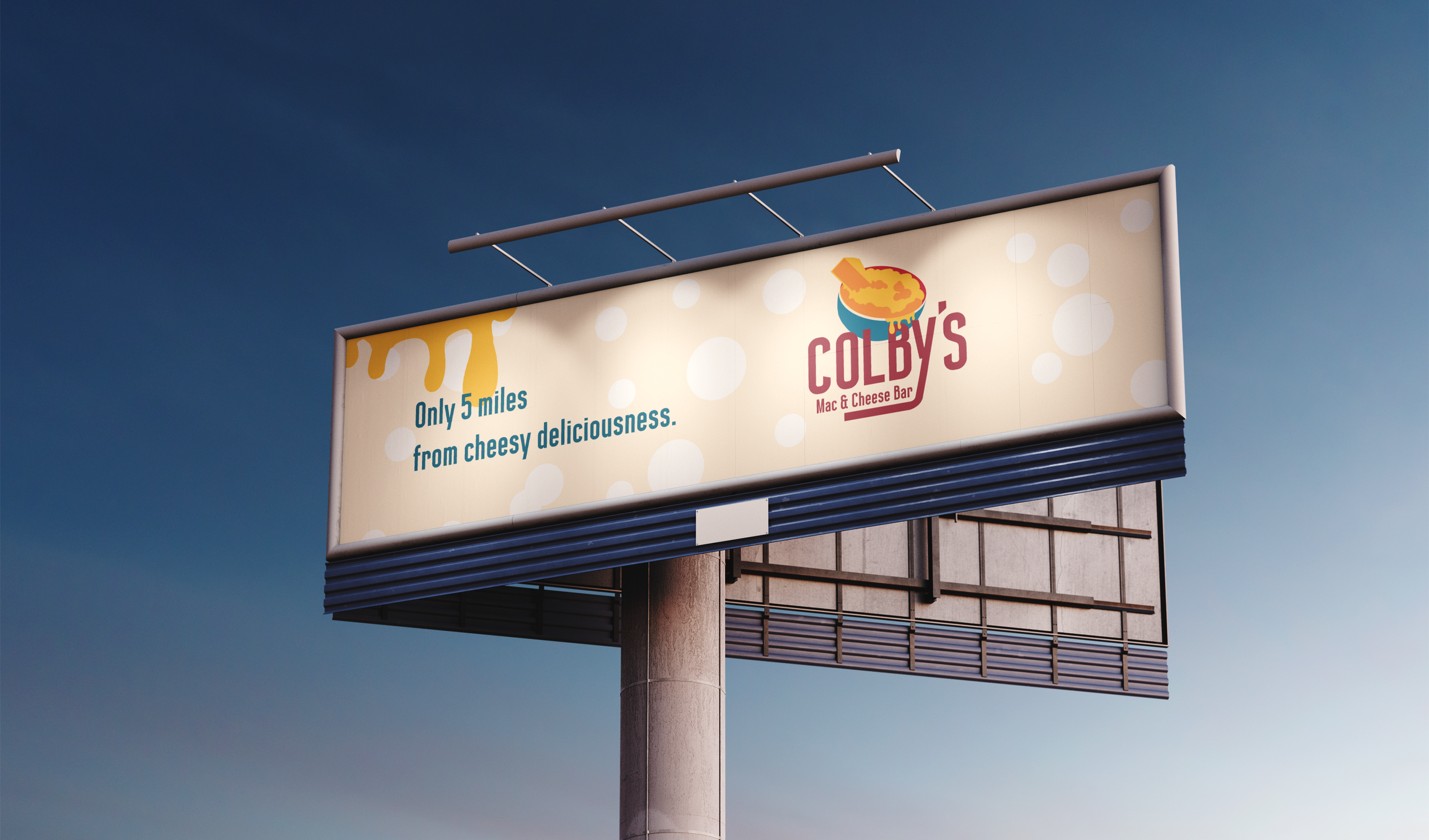
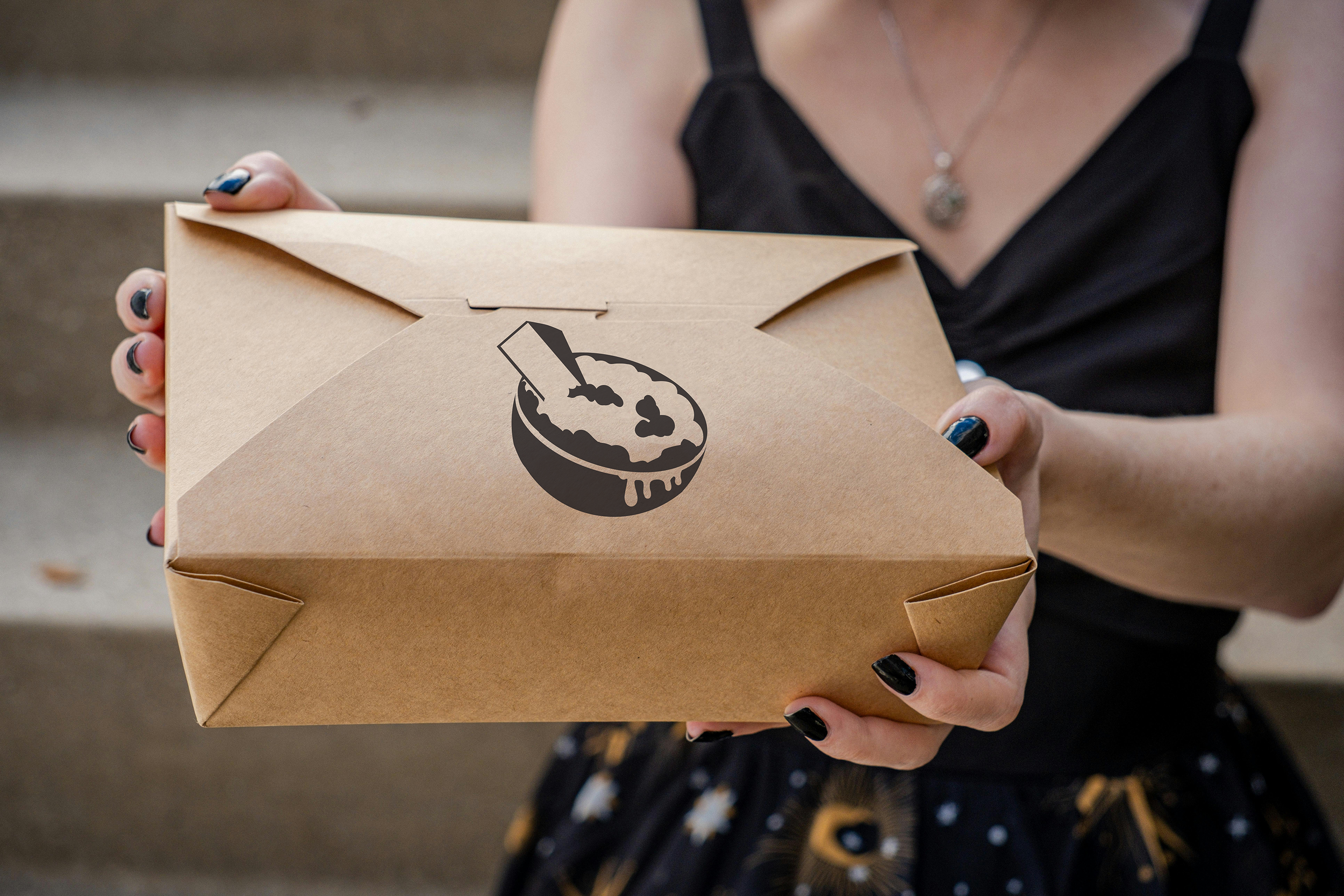
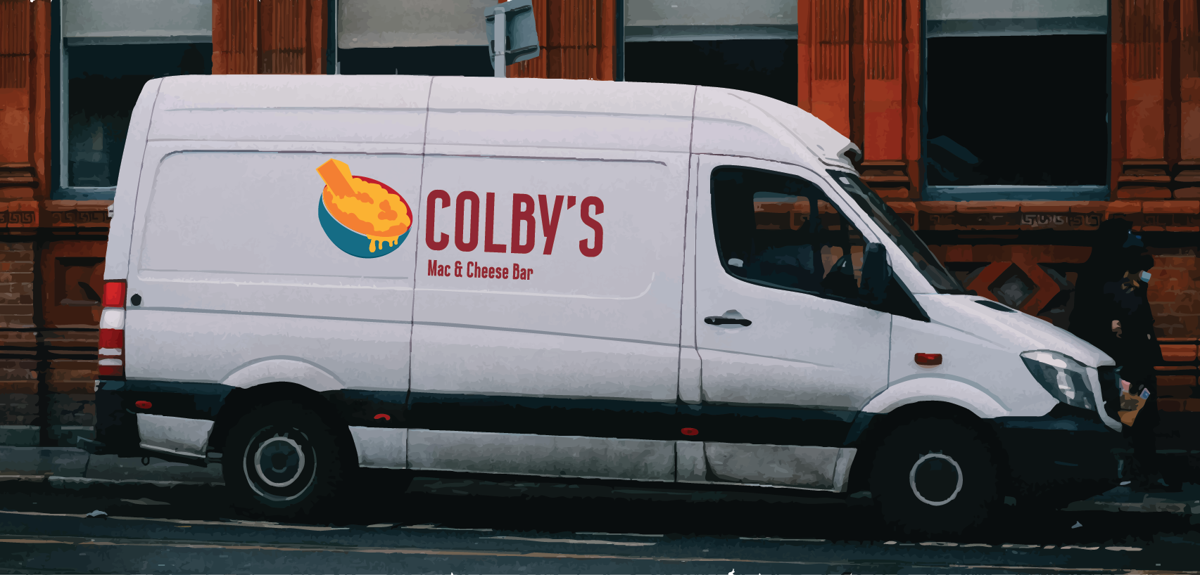
Finally, the collateral work for this project focuses on the feel of the eatery if it were to exist. The primary feel of this eatery was something I aimed to feel homey with a slight touch of rustic to it, and would exist in a city setting. With those details in mind I selected images that I believed fit the style and theme, as well as selecting products that I believe would realistically be included in the eatery.